
Project Overview
The goal here was to conduct a heuristic review of the website as well as conduct a usability evaluation. The usability test was done remotely
My Process
The heuristic review was done first in order to pull on my own existing knowledge and perspective, while using an established set of heuristics, to find the easily identifiable issues first. This way, more important usability and interface issues can be identified and focused on during the usability testing by various participants. The usability testing was done second, and included 5 different participants of varying demographics, technical expertise, and experience using the site or sites like the one being evaluated.


Heuristic Review
The heuristics used are those attributed to Ben Schneiderman, known as "Schneiderman's 8 Golden Rules".
1. Strive for consistency.
2. Seek universal Usability.
3. Offer informative feedback.
4. Design dialogue to yield closure.
5. Prevent Errors.
6. Permit easy reversal of actions.
7. Keep users in control.
8. Reduce short term memory load.
After selecting the heuristics, I then explored the site and evaluated how well it adhered to each heuristic. For example, if some portion of the website interface did not respond to my actions, was unfamiliar, or did nor produce a desired result, then it was noted as a violation of the heuristic "Keep users in control".
NOTE: I will not be showing every single finding from the heuristic review, as there were many. I will provide and explain 2 examples.
Heuristic Violation:
When viewing a selected apartment listing page, there is a sub-navigation bar with the options to view Q&A, leasing, floor plans and pricing, features and amenities, and ratings plus reviews. The content is set up so that each section is on top of the other which creates a very long scroll. When you select an option, it pushes you down to that section of the page. If you want to get back to the top, there is no quick way to do so. The user must either manually scroll the entire page back to the top or select the navigation option that brings you closest to the top and then scroll the rest of the way.
Heuristic Violated: "Permit easy reversal of actions"
Proposed Solution:
Refactor the way that content gets displayed and make it more component based instead of stacked content that users jump to or scroll through. The content that would show below the sub-navigation bar would change depending on the active nav-item.
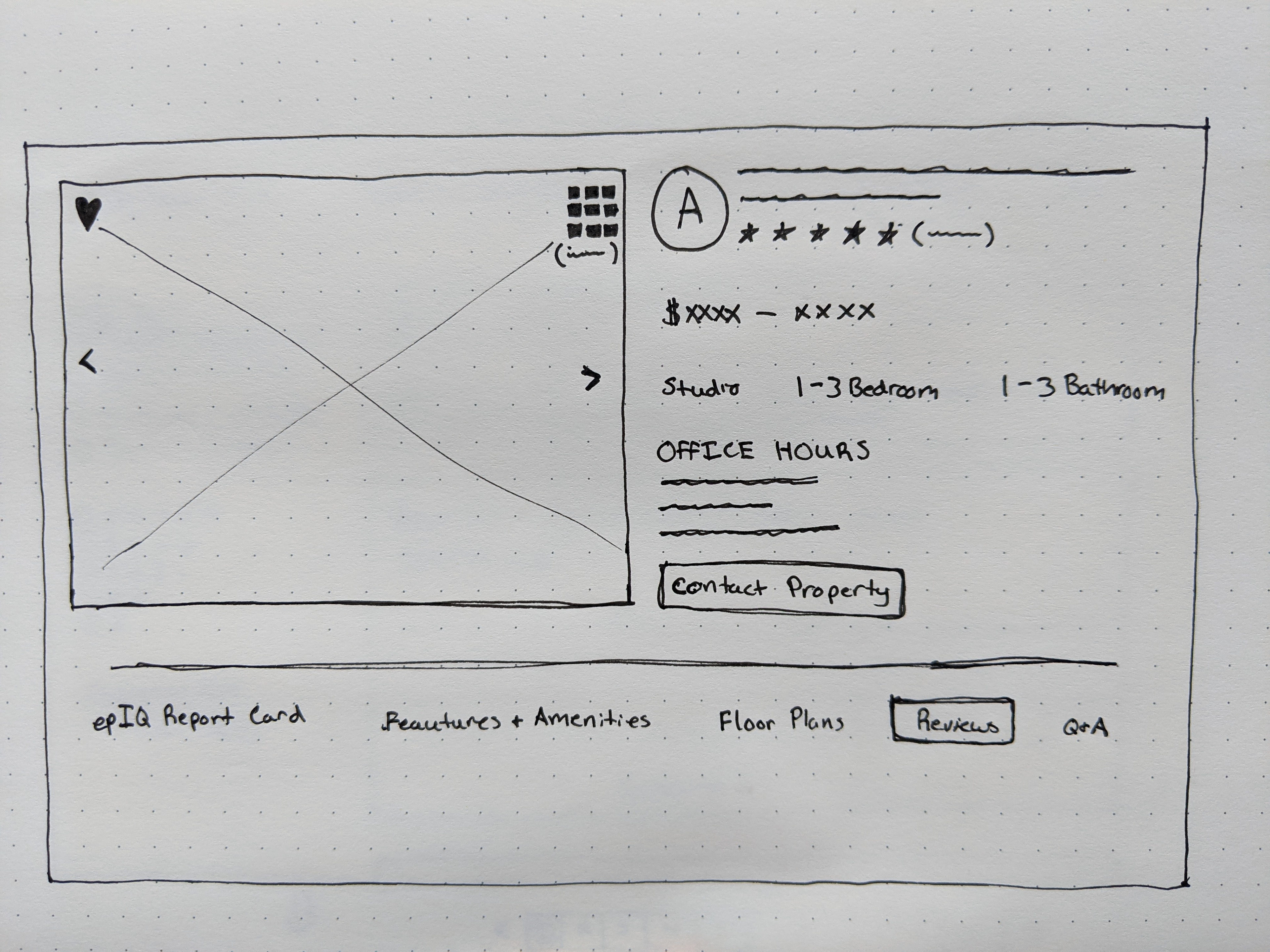
Heuristic Violation:
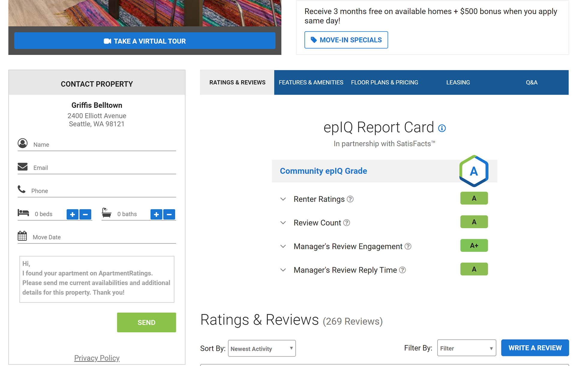
When viewing a selected apartments page, there is a “contact property” box located below the photos available to view and to the left of the sub-navigation menu. This is always present no matter where you scroll to on the page and is the only feature to do this while having its content always displayed
Heuristic violated: "Keep users in control"
Proposed Solution:

My suggestion would be to make this a nav-item on the same navigation menu that has “features & amenities”, make it a button, or make this section obviously collapsible. For the sketched solution, I chose to make it a button that, when clicked, would show everything needed to contact the property via a pop-up
Usability Evaluation

NOTE: I will not be showing every single finding from the remote usability test sessions, as there were many. I will provide and explain 2 examples.
Participants
User 1:
Male, 54, IT Manager, new to site, 18m 19s
User 2:
Male, 22, IT Undergrad student, new to site, 18m 17s
User 3:
Female, 24, School Phycologist - M.S., new to site, 14m 25s
User 4:
Female, 62, Regional Corporate Sales Manager, new to site, 44m 41s
User 5:
Male, 25, Accountant, new to site, 17m 20s
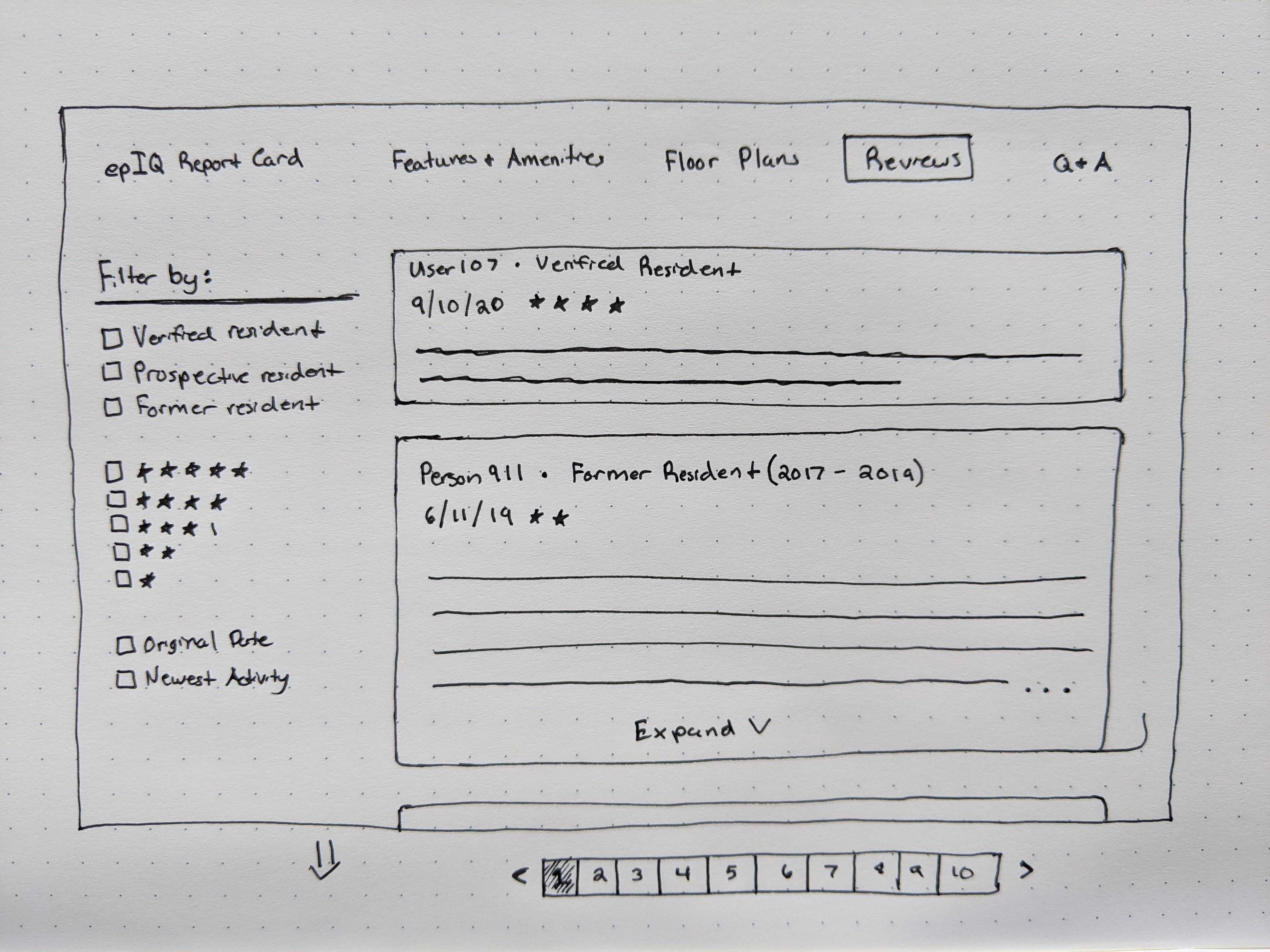
Usability Issue:
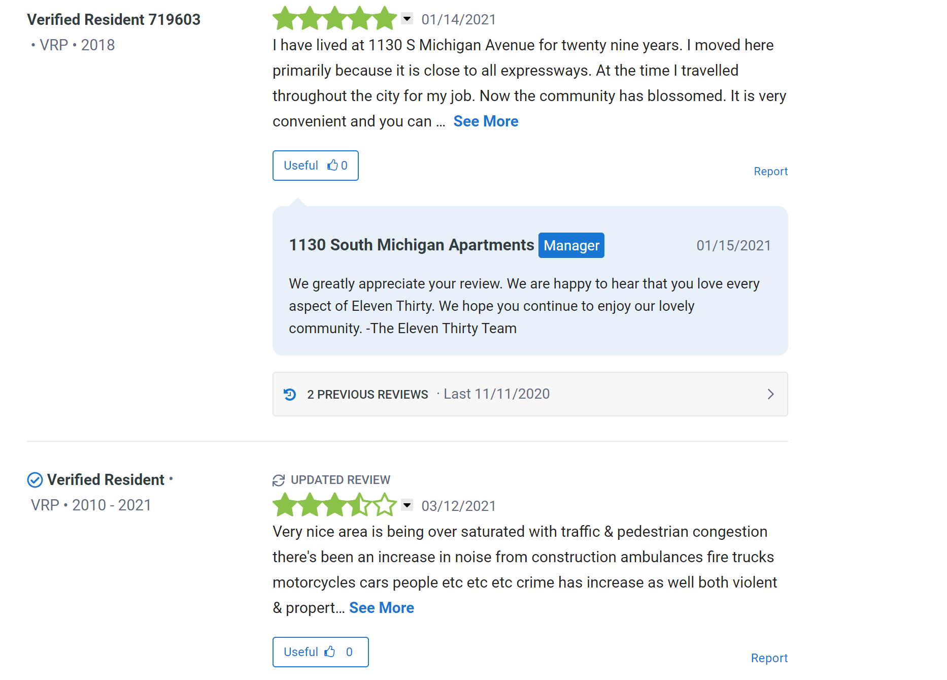
Almost every single user struggled with identifying which apartment reviews were made by a person who was verified to be a resident. This was because some reviews were labeled “Verified Resident” and other reviews were labeled “Verified Resident”, but with a blue check next to the labeling. This confused users on which was an actual verified resident.
Proposed Solution:

Add a filtering option to separate reviews by different resident categories such as “verified residents”, “prospective residents” “former resident” and any other relevant classification. Also, design a clear difference between verified residents and non-verified residents.
Usability Issue:
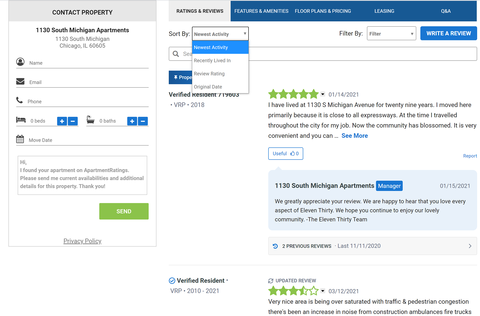
Users were confused with how to find the most recent review made because you could sort by both “newest activity” and “original date”, along with a few other options that made the process of searching unclear
Proposed Solution:

Use a side filtering UI element to help make the search process clear for the user. The content will automatically update based on the filter selections chosen, without any filtering options disappearing and reappearing, which also contributed to the filter and search confusion.
Thank you for viewing my work! Please feel free to reach out for any reason