Project Overview
Design an augmented reality story on the coronavirus pandemic that acknowledges the Washington Posts current augmented reality user research, helps users better understand new information through this format, and engages users throughout this experience.
My Process Outlined
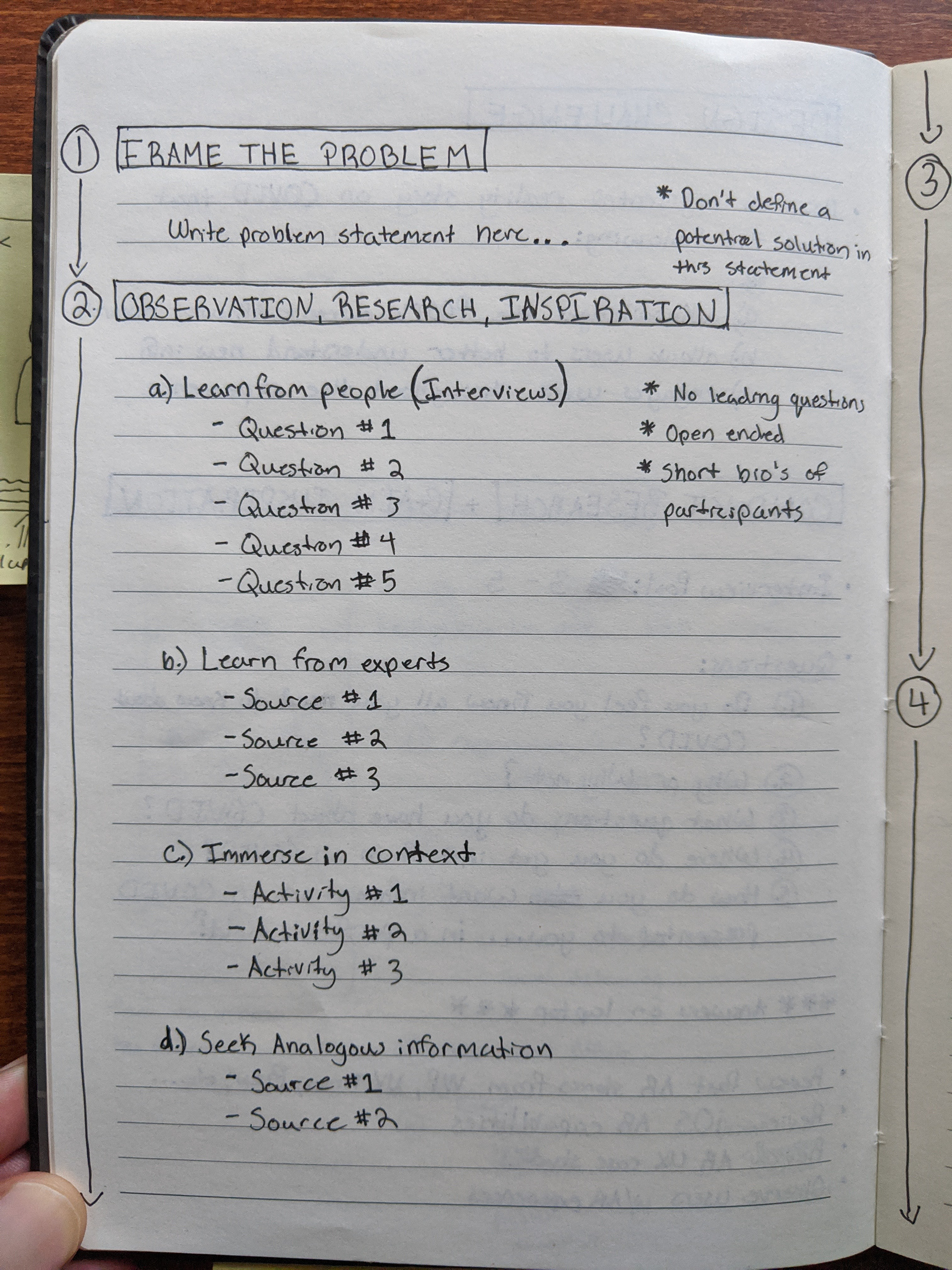
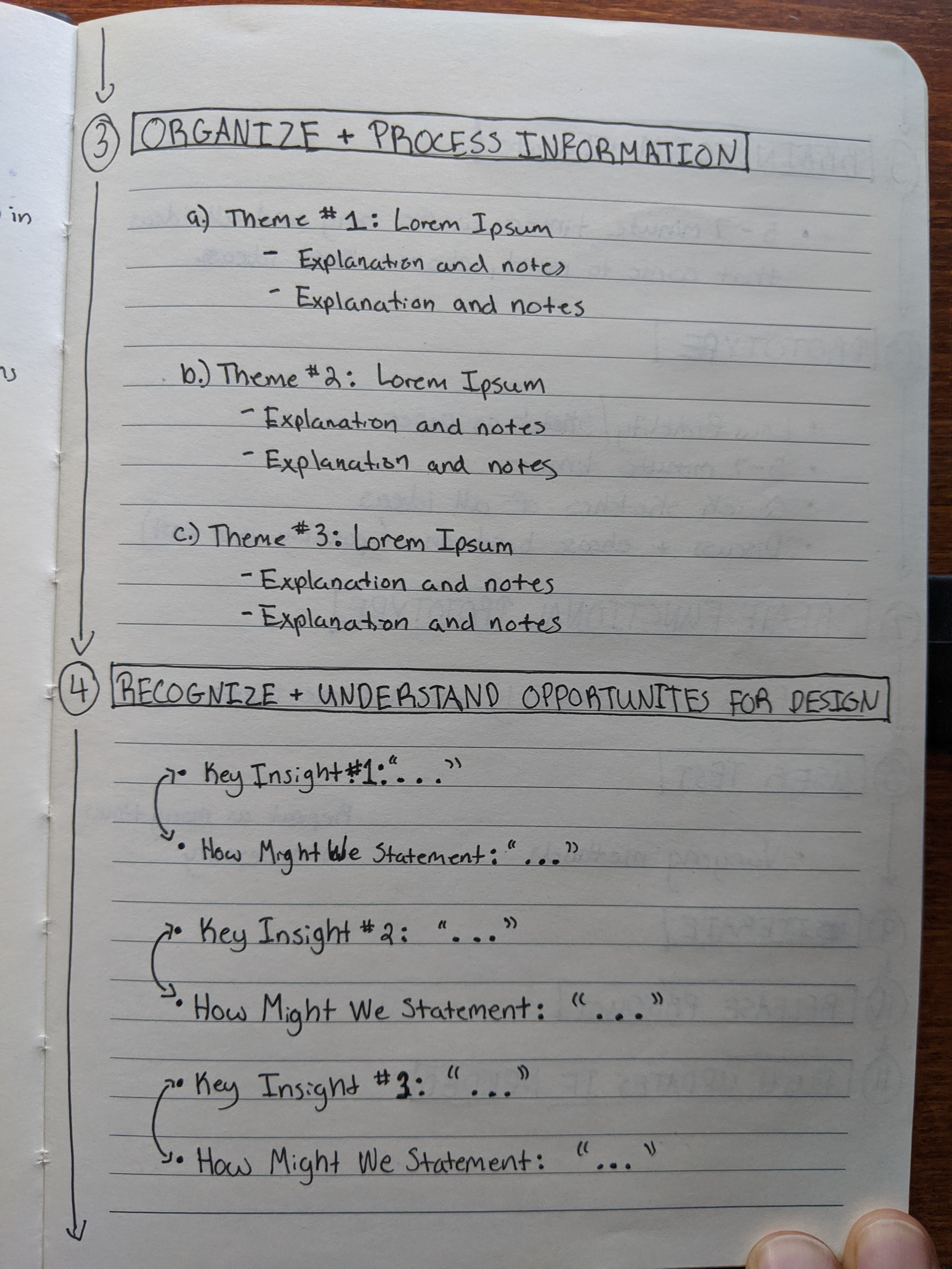
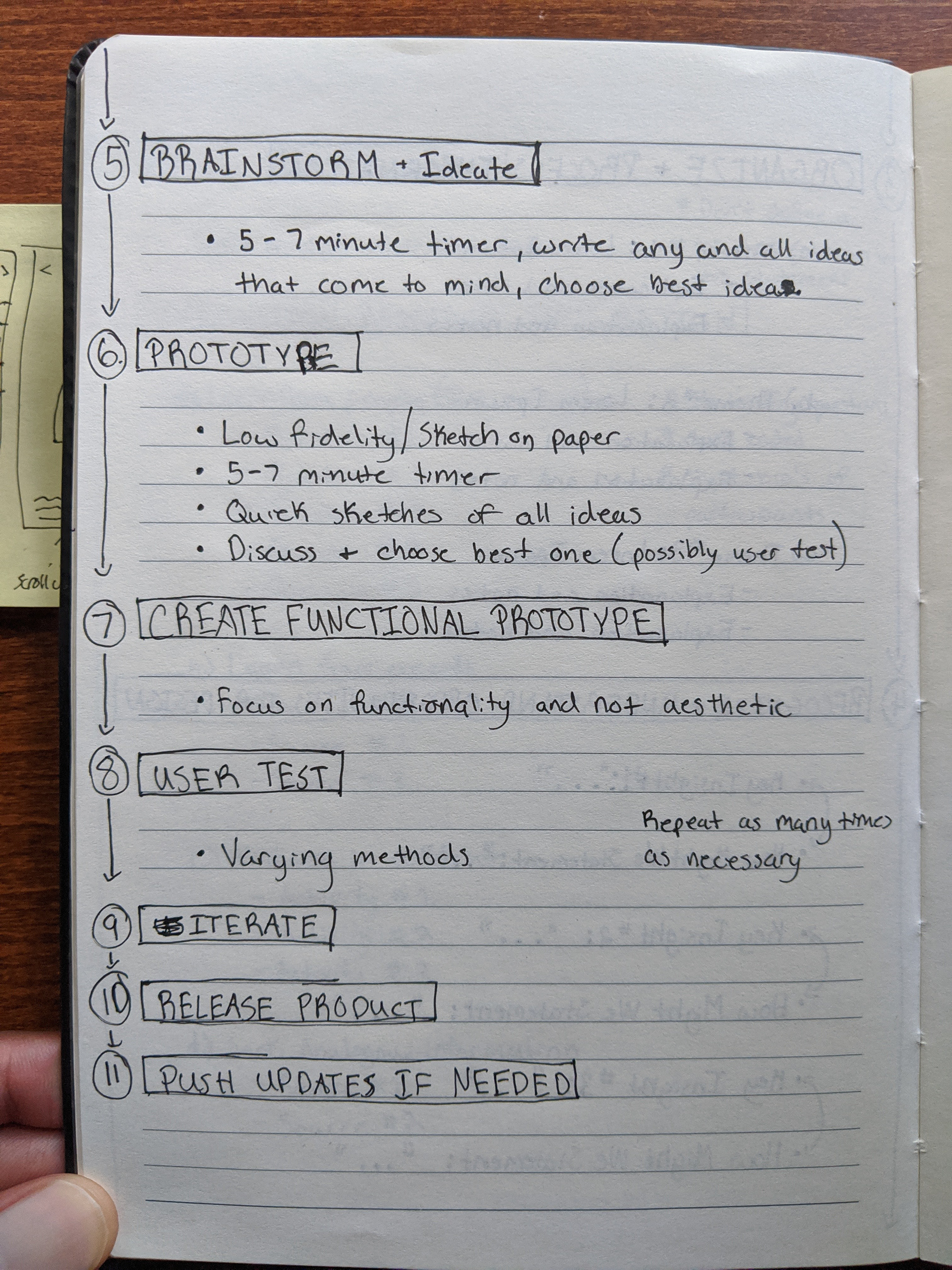
Here is a detailed outline of the research and design steps that I normally take. I normally take a human-centered design approach. For this design assessment I chose not to go past step 6 as to not spend too much time building an entire experience start to finish.
My Design Process Filled In
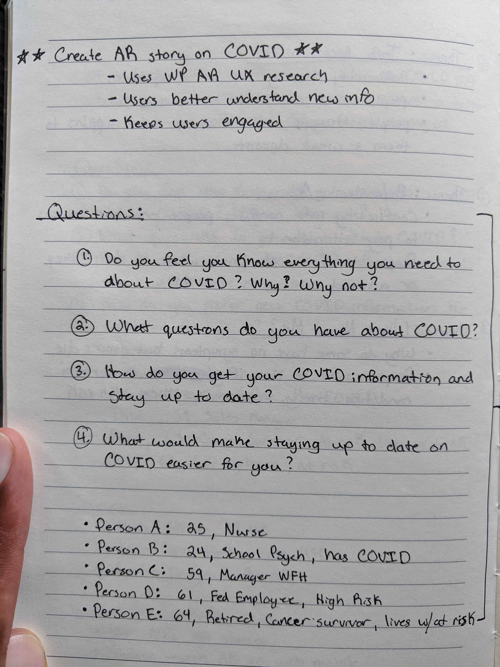
Here are my research and design steps as they unfolded taking part in this design assessment.
Steps 1 - 2

Step 3
Step 4

Step 5

Step 6
Step 6
Example of Low Fidelity Prototyping for AR
Brief Process Explanation
After framing the problem statement without mentioning any possible solutions within it, I started to conduct potential user interviews as well as exploring other service journalism AR experiences and angles. After completing the aforementioned, I quickly researched AR user experience case studies and iOS AR capabilities and limitations among a few other things.
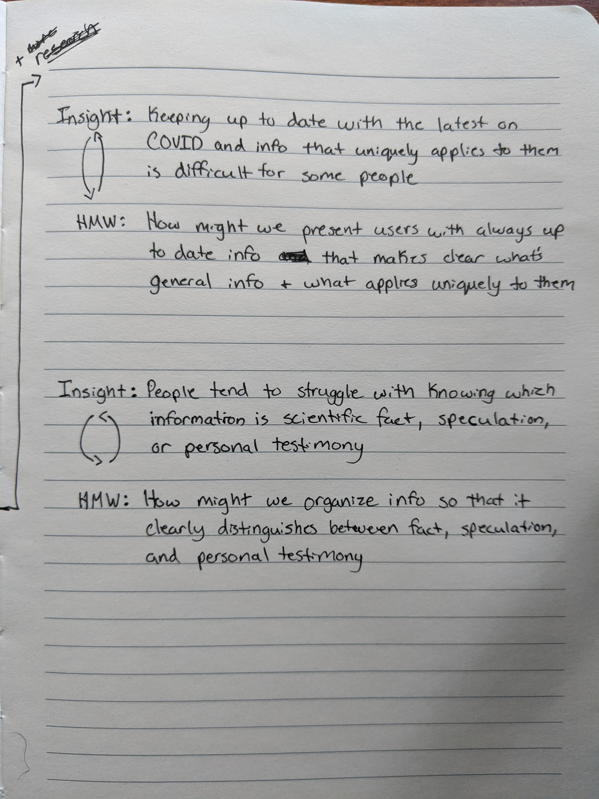
Next I organized all of my information and pulled out common themes from user interview answers along with a few notes about each. After organizing common themes and other information, I then wrote down key insights paired with "How might we" statements in order to provide a springboard for brainstorming and prototyping.
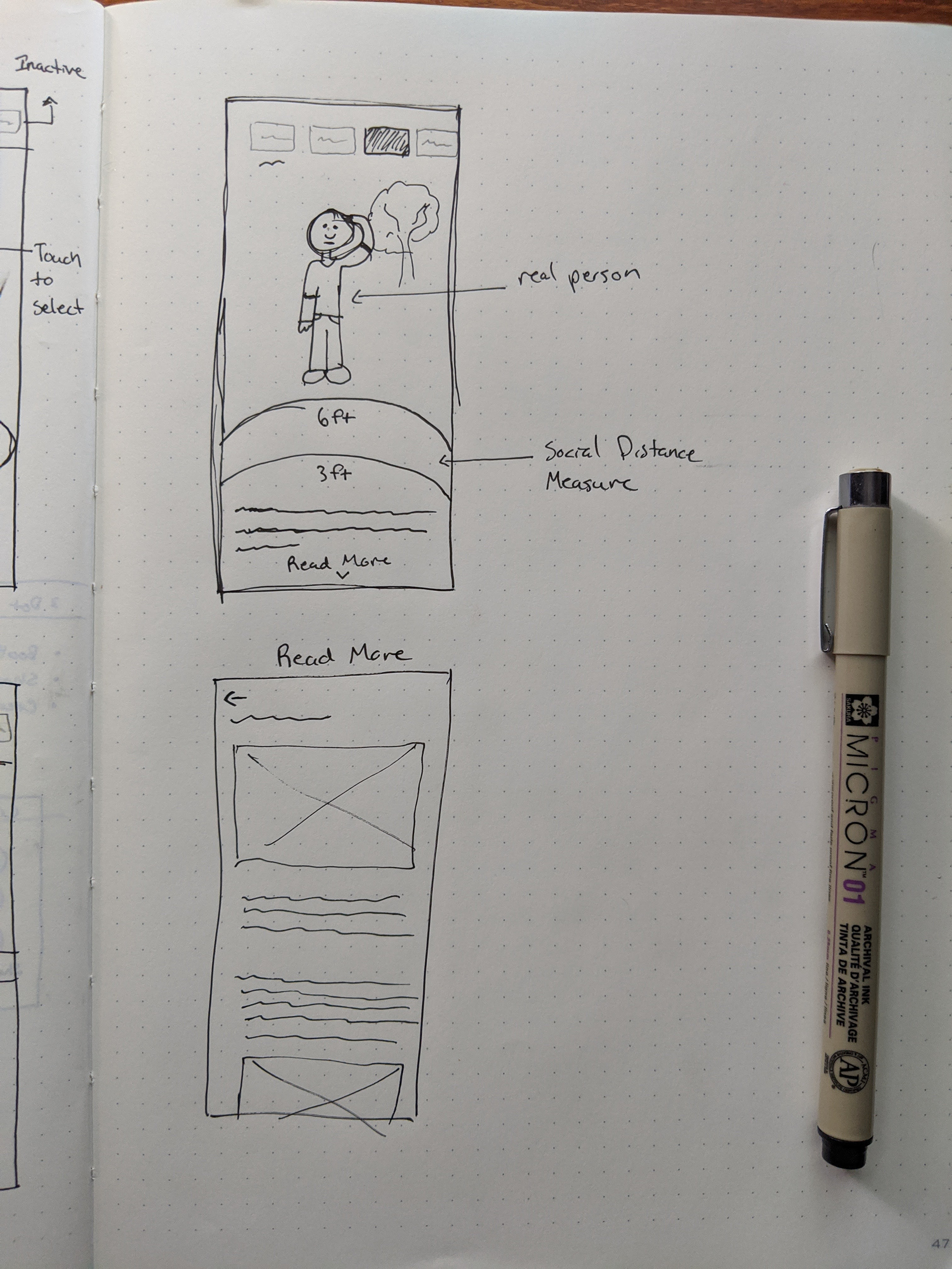
Lastly, after setting a 7 minute timer and sketching out any and all ideas that came to mind, I reviewed each idea, chose the one I though made the best solution, and begin to do low fidelity prototypes on paper. Had I gone past this step, I most likely would have made a somewhat functional prototyping using paper, my phone camera, and possibly a trophy or another human being to act as an AR object. This would've been done to test the "world space" and "screen space". World space refers to the elements in the world around you and your device (tables, chairs, surfaces, people, etc) and screen space refers to elements on the screen of your device (markers, highlights, generated objects, pop ups, etc). Seeing how elements in world space and screen space interacted with each other would've provided valuable insight for further iteration.
Where I landed:
The idea I landed on is one that allows users to explore a COVID article or story that presents different information categories as AR experiences. The AR experience and "read more" information at the bottom of the screen each update depending on the category you're in and any live updates pushed to the article or story. The experiences include an AR graph users can interact with that shows different COVID statistics and an AR social distancing circle that recognizes and interacts with those around you. There is also a more "traditional" AR article experience where a user is presented with a virtual human and scrolling up or down changes the orientation of the human in order to show different parts of the body and COVID symptoms that occur there.
How does this acknowledge the Post's current AR user research?
I believe this recognizes the Post's current user research due to this being optimized, in theory, for an iOS AR experience. While researching iOS AR capabilities, I saw that Apple had made improvements in depth recognition which makes some of my designs above possible. Also, these designs are, in theory, very conducive to a mobile experience and WebAR. However further testing and iterations would be needed to confirm. There are not many button clicks at all so this keeps the user fully engaged and prevents information burnout. Lastly, this experience would provide all actionable information.
How does this format help users better understand new information?
In my experience while working with museums, people prefer learning through sight and sound. I truly believe this would help users better understand new information. Even while conducting user interviews, when asked how they would prefer their information presented to them, most people said through some visual means (videos, photos, data-visualizations, etc). If a user for whatever reason decides they want to read, the "read more" option is at the bottom of the screen and is easy to access. In theory, live updates would be pushed to the experience as well so users have the most relevant and up to date information
Does this keep users engaged throughout the experience?
I believe so. This answer is pretty identical to the one above. People are more engaged when information is presented through visual means, especially since they get to control it themselves.
Questions I would ask to measure success for this project
Does this decrease interaction cost for the user (Y/N)
Does this reduce the users cognitive load? (Y/N)
If combining multiple sources of information, does this minimize attention switches? (Y/N)
Does this experience work regardless of the users physical environment? (Y/N)
Does this app make it easy for users to become unaware of their surrounding and get hurt? (Y/N)
Is the on-boarding intuitive for users new to AR? (Y/N)
Does user testing or analytics show an increase in user engagement and understanding? (Y/N)
How many people shared the experience? How long much time did they spend on the experience? How exactly did they interact with the experience?
Lastly, the cost.
Thank you for the opportunity! Hope to speak with you all soon, be safe.