Project Overview
This is an interactive that was designed and created for the United States Holocaust Memorial Museum in Washington DC. The interactive allows users to view 9 different historical accounts of individuals and families in their attempts to escape Nazi Germany.
Design Process
This project was completed using the Agile methodology. The initial brainstorming, design exploration, and wireframes for this interactive were already completed before I joined the project team. The intended functionality was also decided on before I joined the project team but continued to evolve after I joined. The project team included both on and off-site developers. This was a physical installation so we designed around ADA guidelines as well.
Step 1
As the main designer for the project, I participated in regular sprint planning meetings involving team members from design, producing, engineering, and animation where we collaboratively organized all the tasks and priorities unique to each project team member before each sprint began.
Step 2
While in the course of our sprints, daily stand ups were held which involved all project team members. We discussed our daily progress and any needs, issues or dependencies that arose. Each sprint lasted between 2-5 days and at the end of each sprint, internal reviews and user testing sessions were held to determine how to iterate and what to include within the next sprint.
Step 3
While designing the stops and crafting the user experience and interface within the interactive, I was participating in sprints, stand ups, and reviews. This was all done while working with on and offsite programmers to design templates within the Unity game engine in order to lighten the developers load when plugging in assets that I created and exported during the graphic production phases. This was an iterative process where I had to navigate Adobe CC, the Unity game engine, content management systems (CMS), internal communications with project team members and external communications with the client team and off-site programmers in different time zones all under tight deadlines.
My Responsibilities
UX Design, UI Design
Interactive Design, Iteration
Photo Manipulation,
Scene Composition,
Graphic & Asset Production
Project Team
Principle, Design Director,
Interactive Designers(1-3),
Animators & Motion Designers
Programmers & Developers
Producers
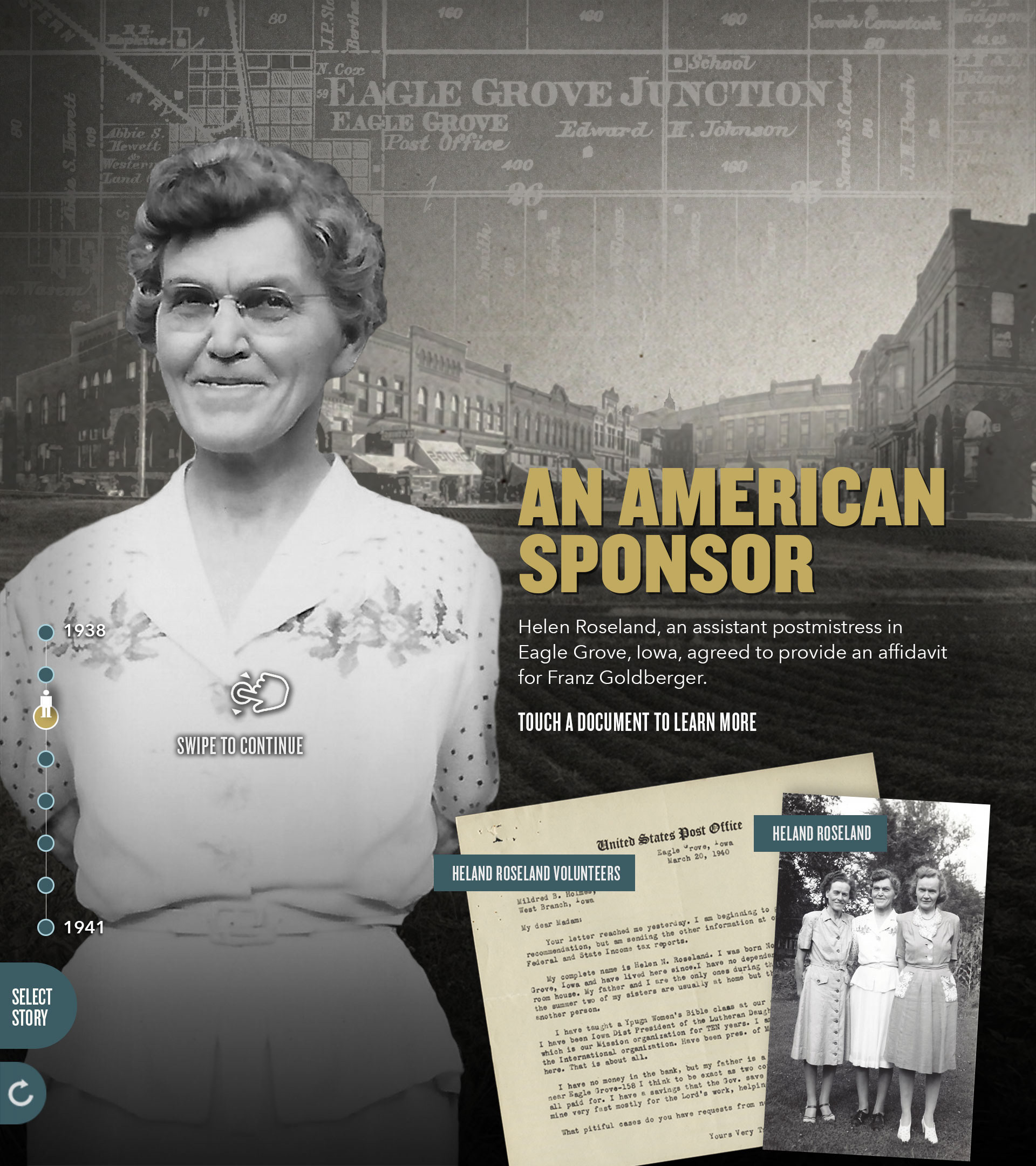
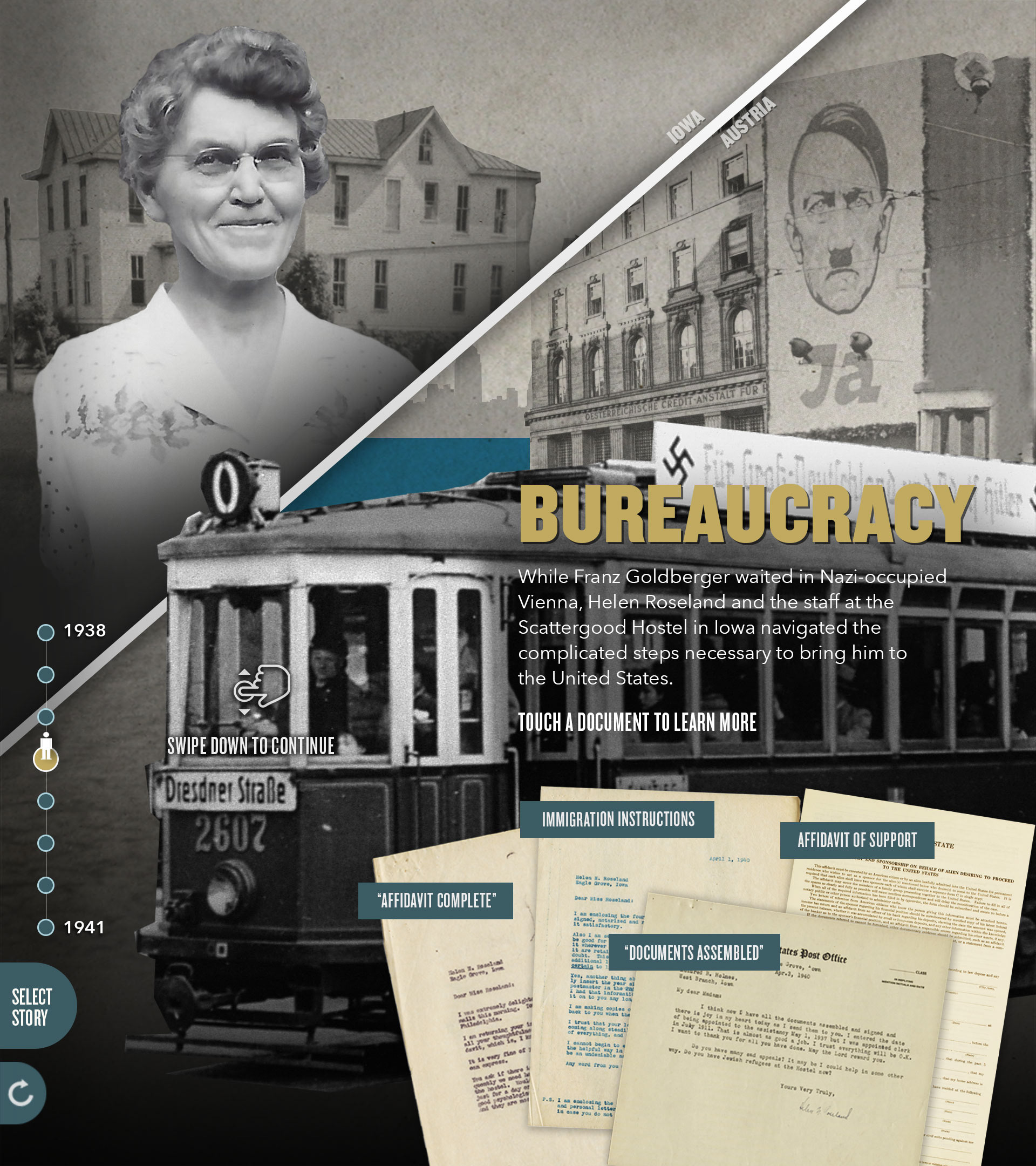
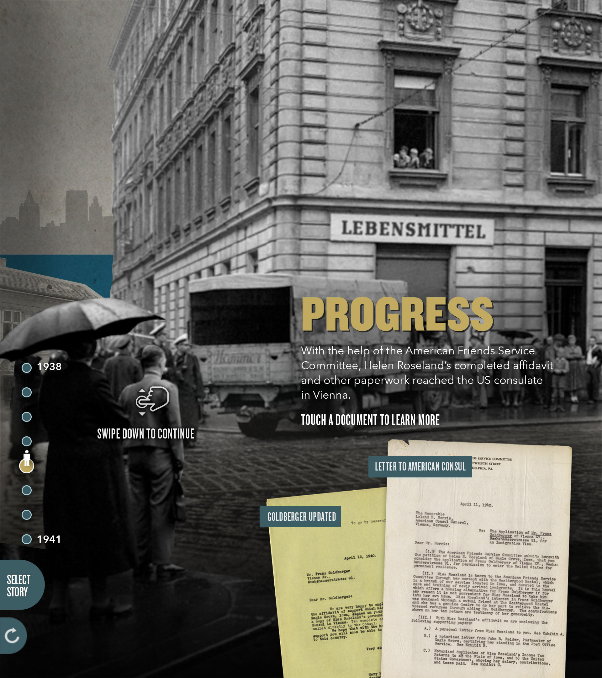
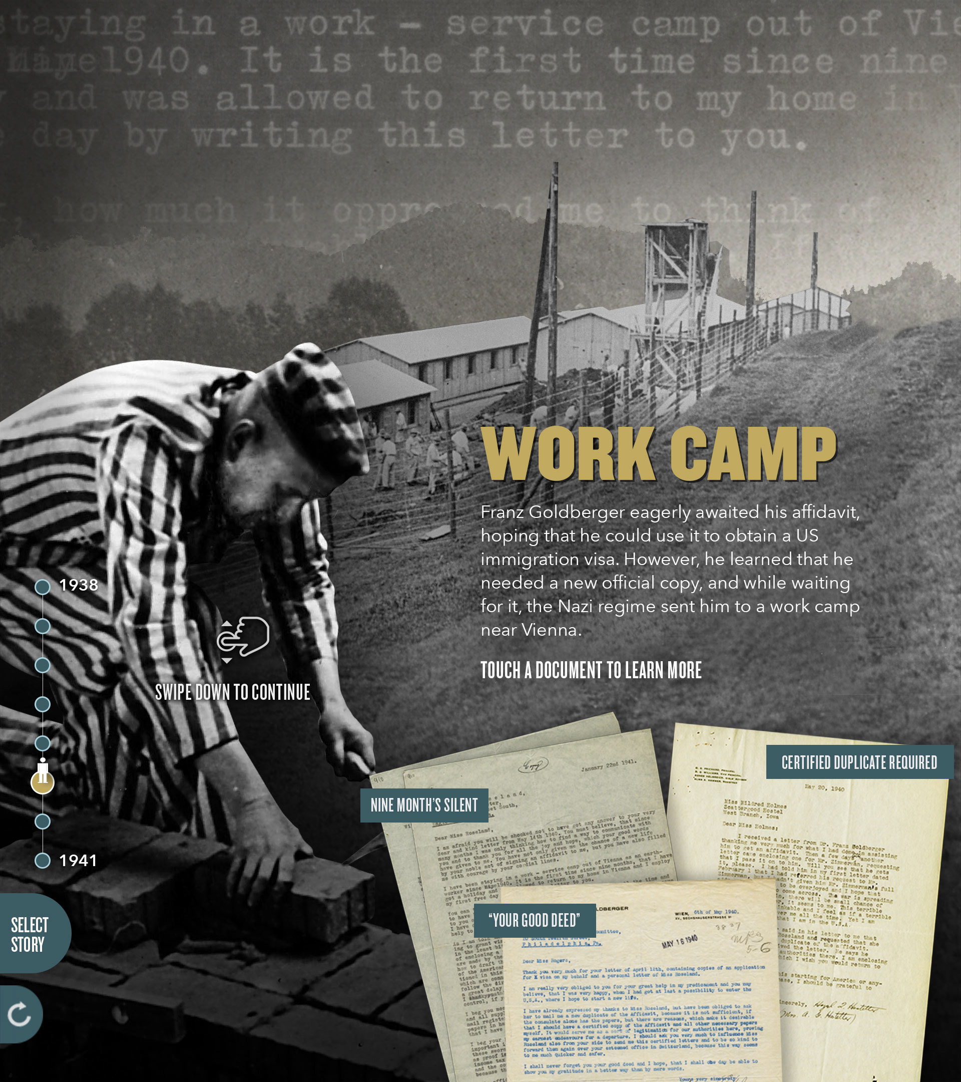
Having to design each stop within a particular journey and craft an inclusive user experience around brief narratives put together by producers and the client team posed a set of unique design challenges during this project.
Design Challenge:
User testing showed that users often times would not read the brief descriptions that explained all that they were viewing. Users instead relied on imagery within the scene and other visual cues to gain any information they needed to understand the story being told.
Design Solution:
Working with producers and the client team, we organized archival imagery to craft scenes that provided visual cues on location, time period, and other important aspects related to each stop. Images were manipulated and combined to create a foreground, middle ground and background which, in addition to stops transitioning through z-space, provided users with a more immerse user experience. Titles were made larger and reworded to act as concise descriptions of a scene while the actual descriptions under each of the titles were reduced to a few sentences.
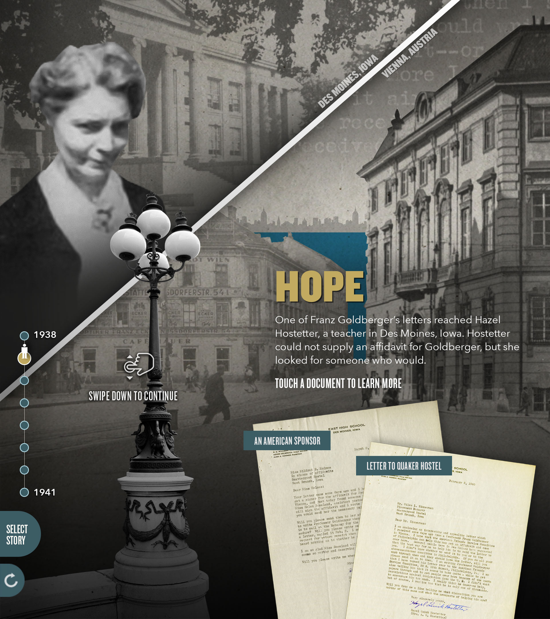
Design Challenge:
User testing showed that at stops where two separate locations were being discussed, users would not pick up on this due to them relying on visual cues instead of reading.
Design Solution:
Design a screen mimicking a split screen view that wasn't obtrusive and clearly showed users that two separate locations are being discussed at this stop. User testing also showed that once users were visually alerted to the multiple locations, they were more likely to read the text to learn more and better understand the story.


Design Challenge:
Client feedback stated that the designs and scenes didn't accurately reflect the extreme levels of despair, hope, and general emotion that each stop warranted. They felt that users were missing out on that important aspect of the interactive which prevented users from fully immersing themselves within the stories.
Design Solution:
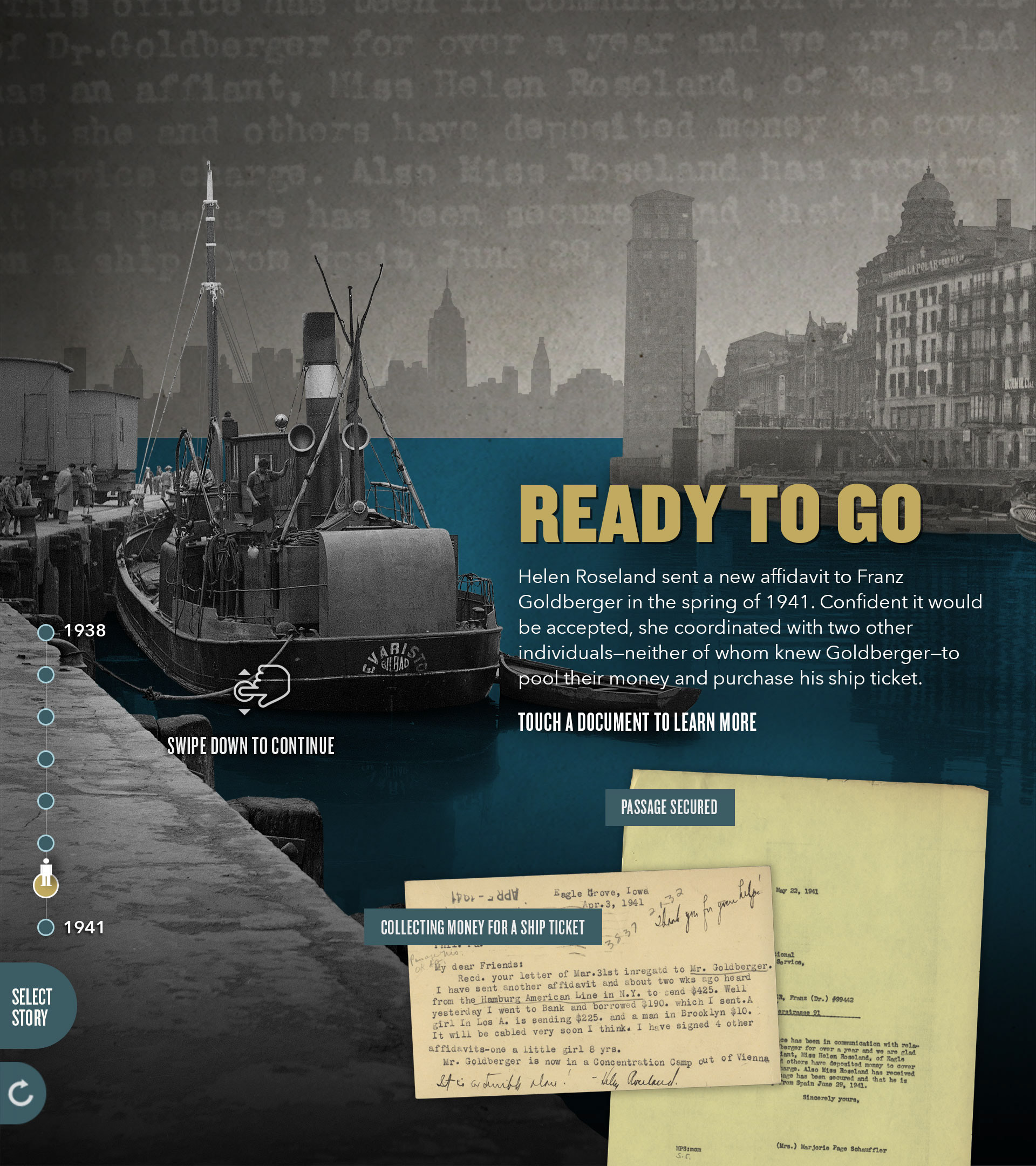
I worked with producers to take archival photographs and compose scenes that reflected the accurate emotions. For example, on the left you have the second to last stop in the story of Franz Goldberger. This stop shows a title saying "READY TO GO" that is paired with a scene showing plenty of blue water, people ready to board a boat, and a New York skyline seemingly within reach. Each of these things, when paired together, gives users the sense of hope that this unique stop in the story warranted.
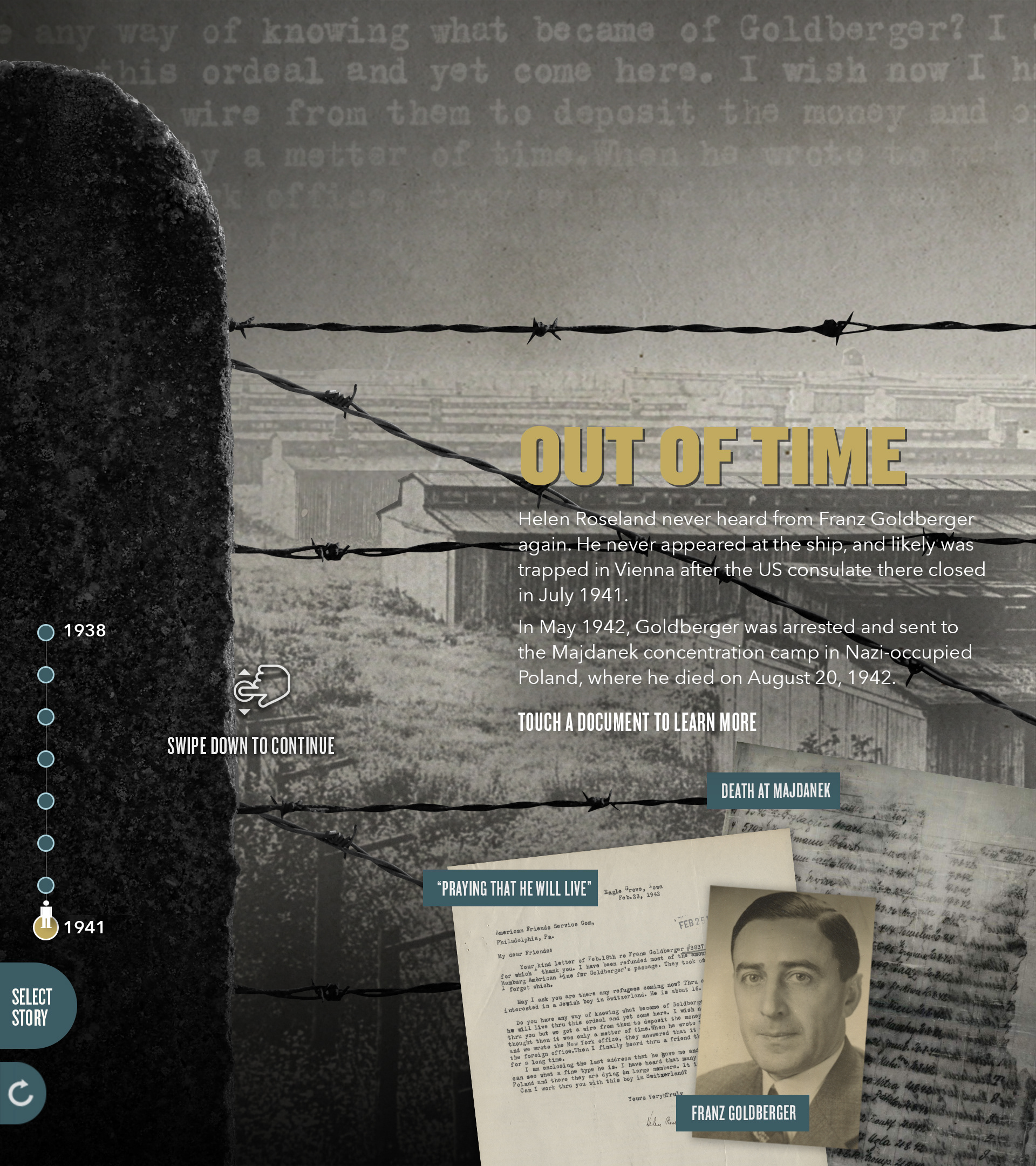
One the right, you have the very last stop in the story of Franz Golberger. This stop shows a title saying "OUT OF TIME" that is paired with a scene showing nothing but a concentration camp and barbed wire. Each of these things in combination gives users the sense of despair and hopelessness that this unique stop in his story warranted. Unfortunately, just as things were in order for him to leave, he was sent to a concentration camp where he later died.
Example of Full Story: Franz Goldberger