Project Overview
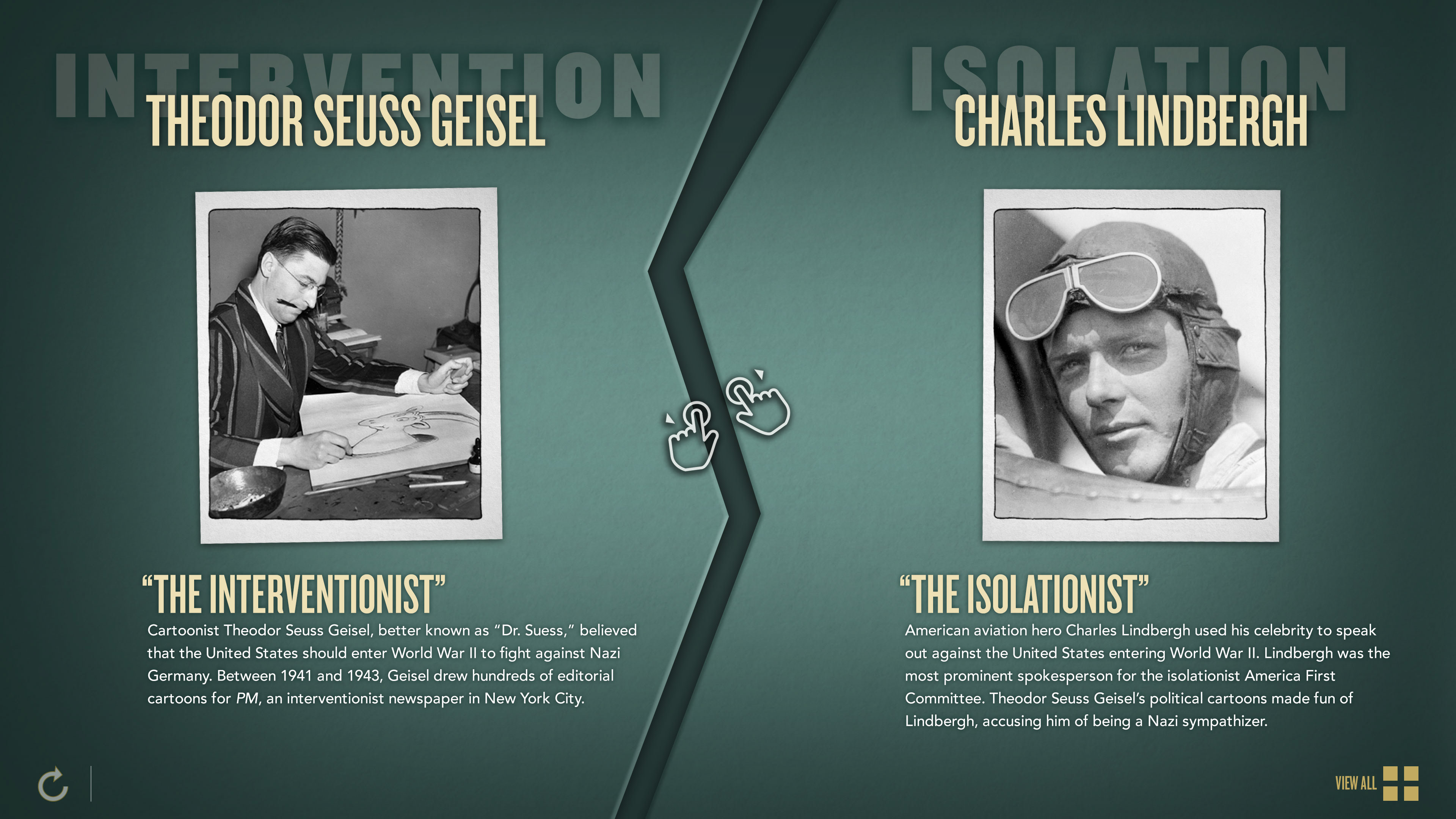
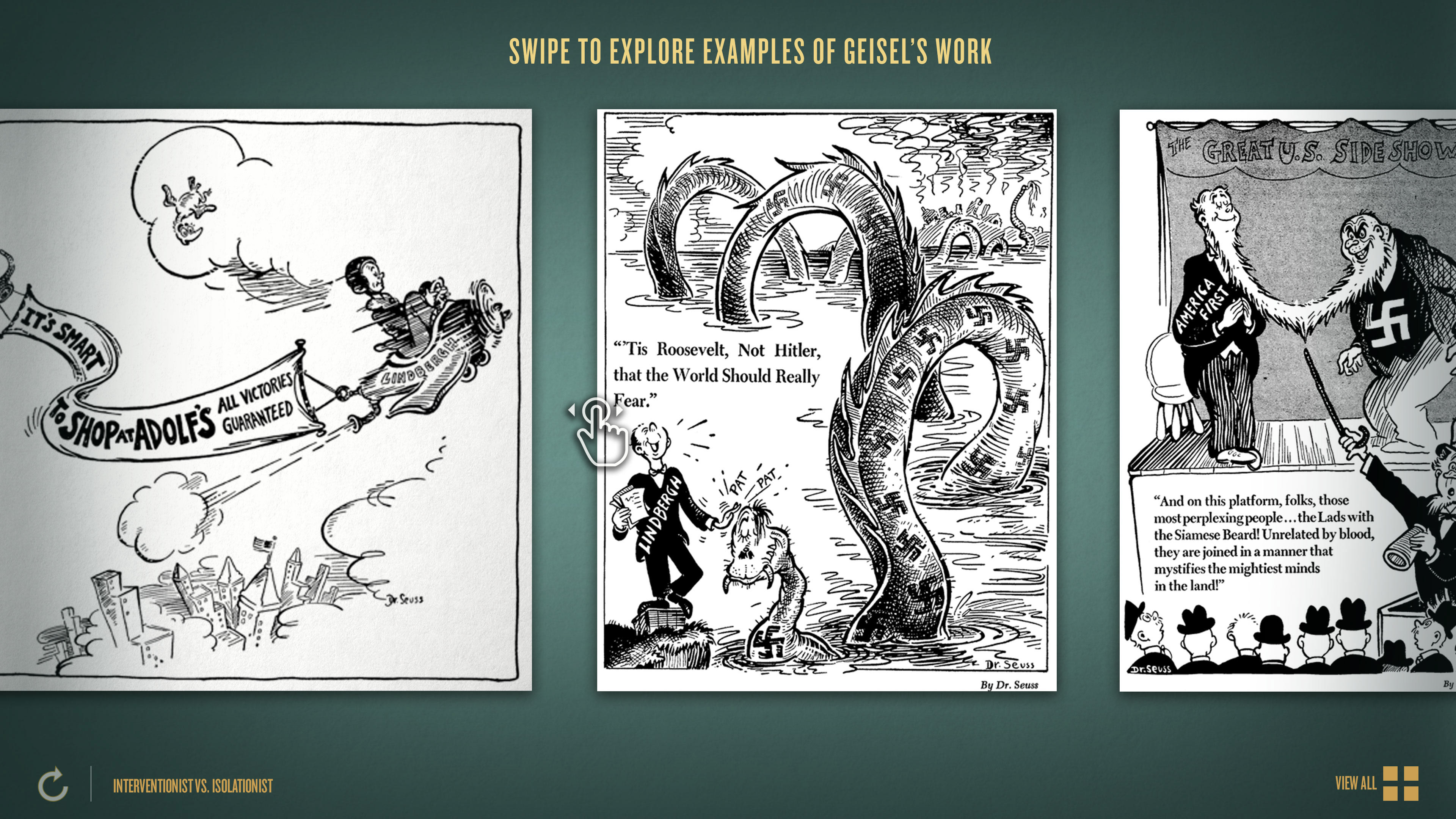
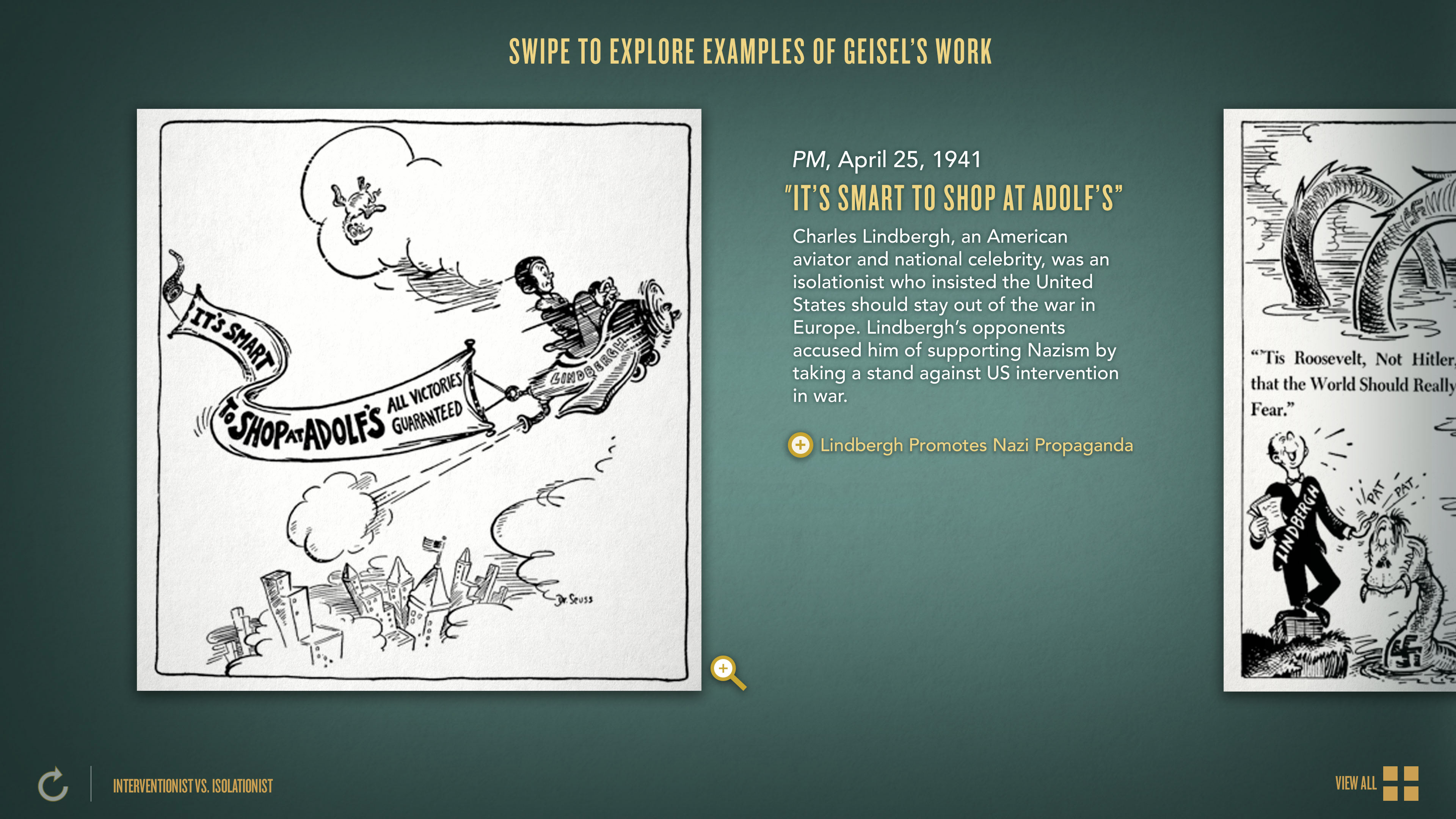
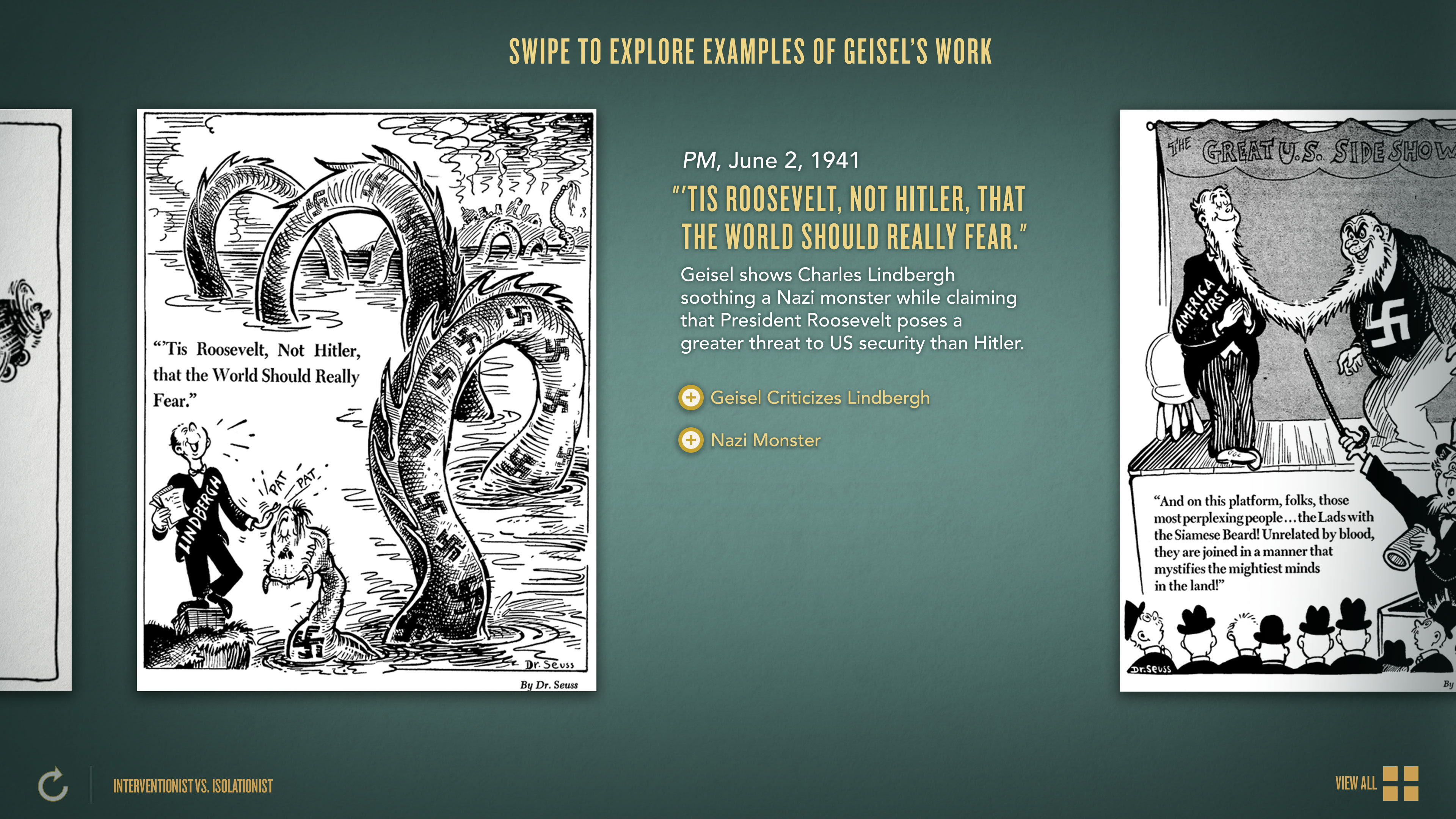
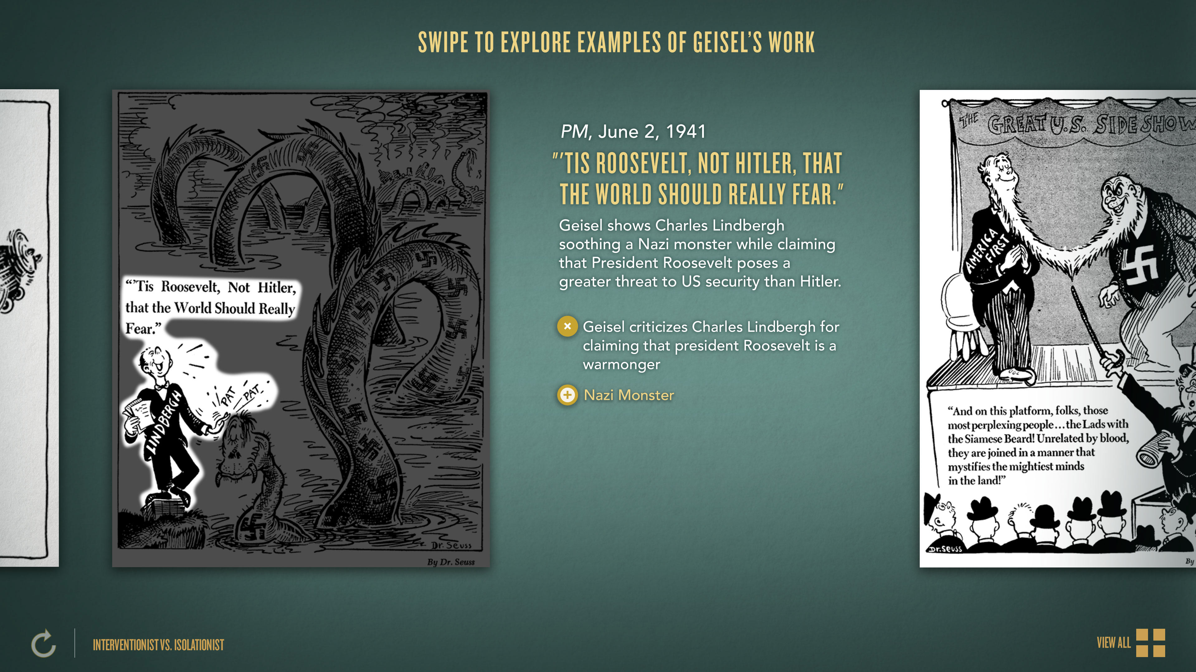
This is an interactive that was designed and created for the United States Holocaust Memorial Museum in Washington DC. The interactive allows users to explore 8 different editorial cartoons created by Theodor Seuss Geisel, or Dr Suess, to learn more about the intervention vs isolationist movements during the war. Visitors may swipe from cartoon to cartoon in chronological order or select between cartoons from a main menu. Each cartoon includes a short caption. Visitors can also pinch-zoom any of the cartoons.
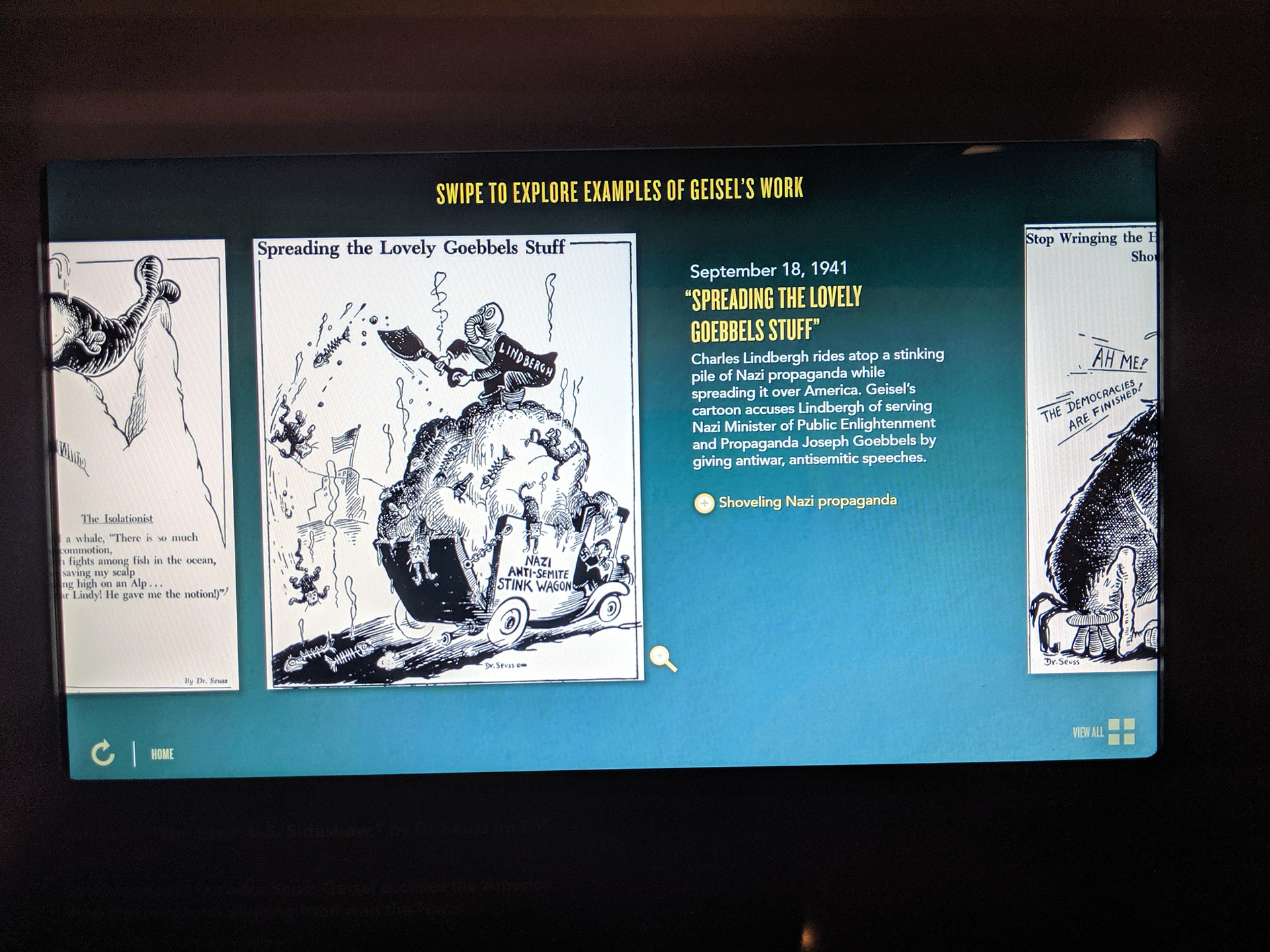
Photo of the actual interactive inside the museum
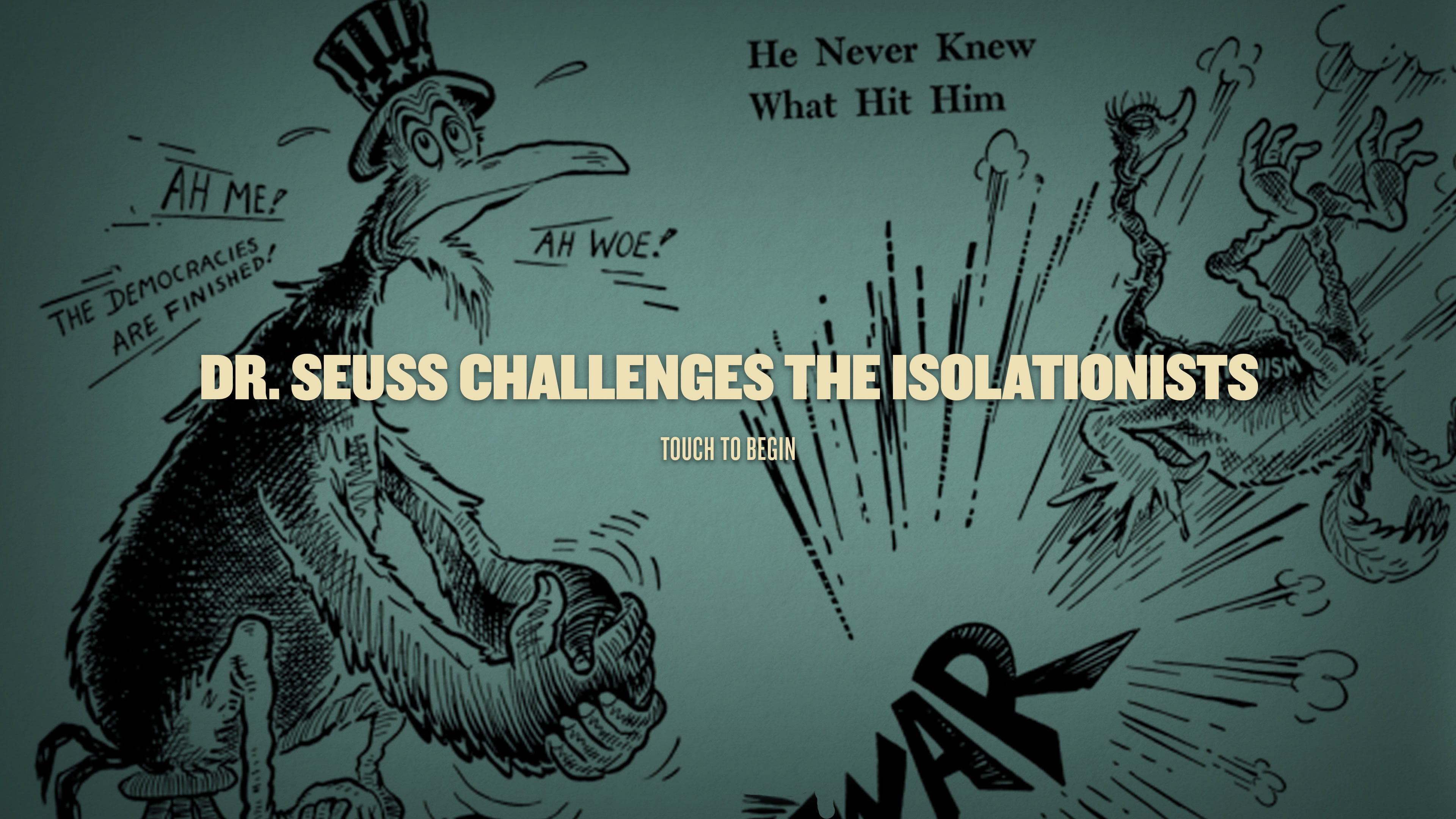
Attract Screen
Design Process
This project was completed using the Agile methodology. The initial brainstorming, design exploration, and wireframes for this interactive were already completed before I joined the project team. The intended functionality was expanded during my time designing on this project team. The project team included both on and off-site developers. This was a physical installation, so we designed around ADA guidelines as well.
Step 1
As the main designer for the project, I participated in regular sprint planning meetings involving team members from design, producing, engineering, and animation where we collaboratively organized all the tasks and priorities unique to each project team member before each sprint began.
Step 2
I picked up from the black and white wireframes and expanded upon the user experience by designing the UI, leading internal reviews, and reshaping the functionality in certain areas in response to user-tests and client feedback.
My Responsibilities
UX Design, UI Design
Interactive Design, Iteration
Photo Manipulation,
Graphic & Asset Production
Project Team
Design Director,
Interactive Designer,
Programmer
Producer
Having to design an inclusive user experience for this interactive posed a set of unique design challenges.

Design Challenge:
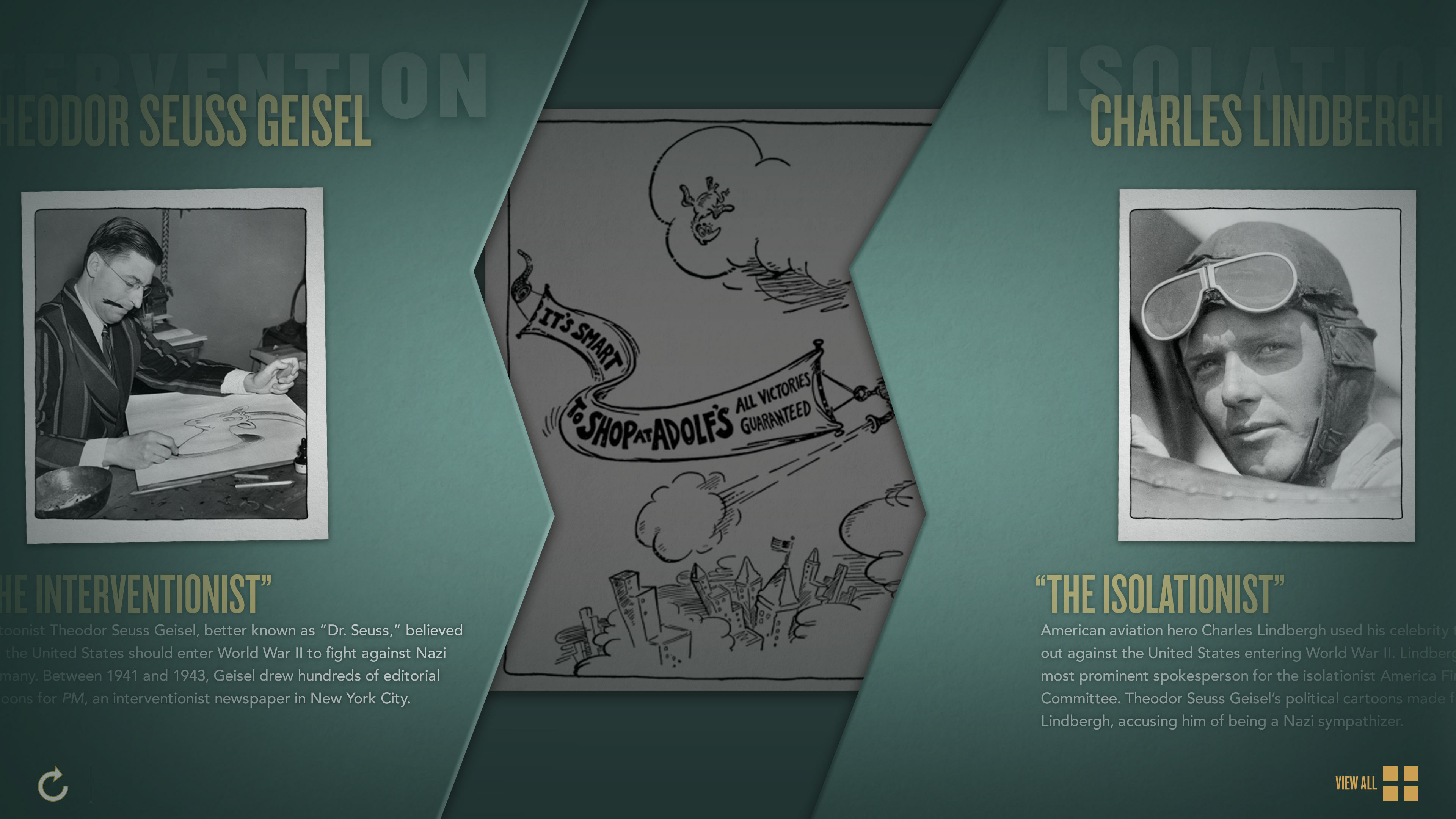
Originally, when a cartoon was selected, both the selected cartoon and the following cartoon simultaneously slid in opposite directions and then the information would appear. User testing showed that users often would know which cartoon to associate the information with due to the information not being clearly attached to one of the cartoons.
Design Solution:
New design frames were created to propose a change in functionality so that once a cartoon was selected the cartoons would separate to create space and the information would then visibly slide from underneath the cartoon with associated with. Another round of user testing showed that this was the visual cue that users needed to make the connection between cartoon and related info. This design exploration was done in conjunction with programmers to ensure the changes were feasible
Design Challenge:
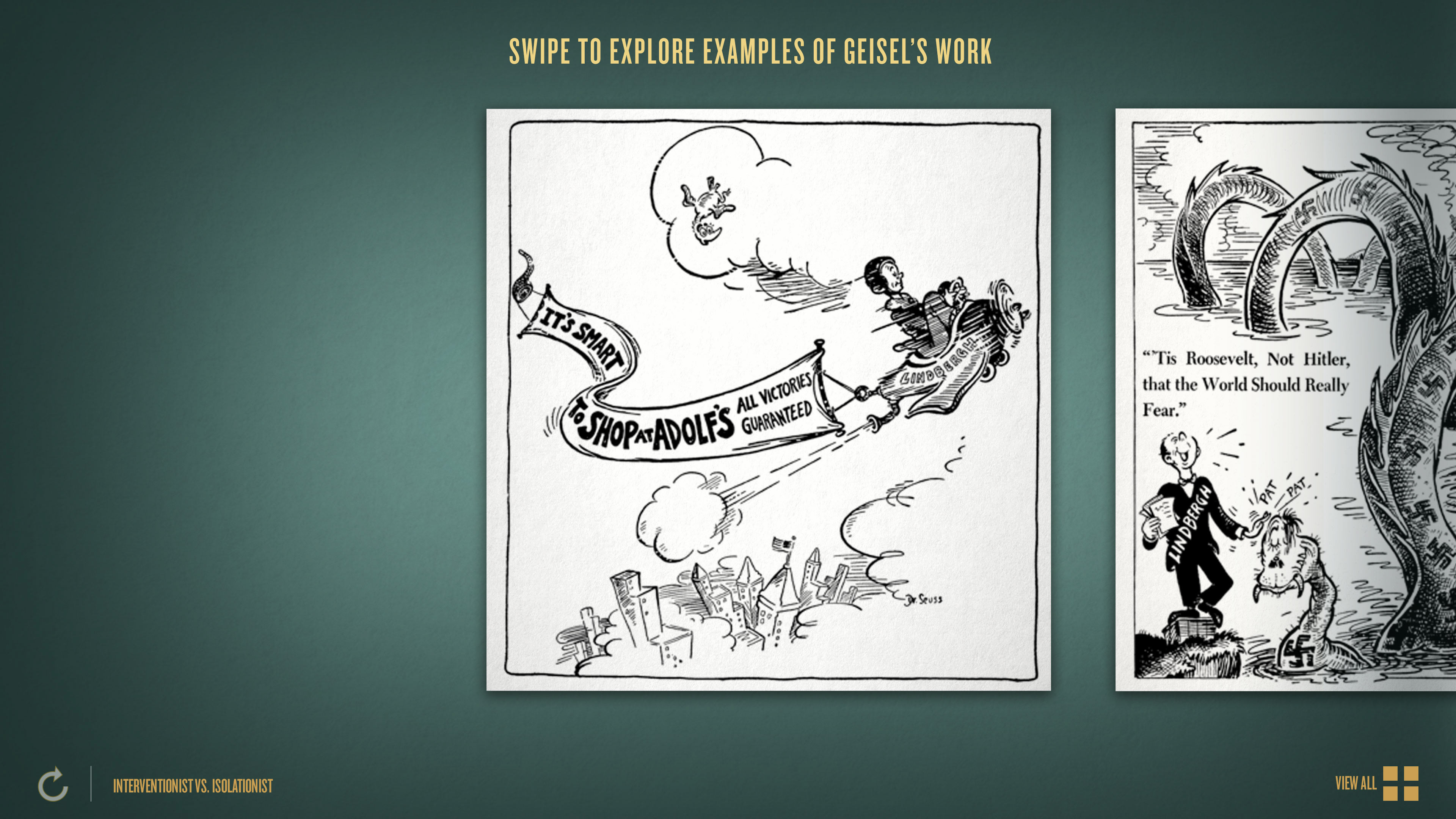
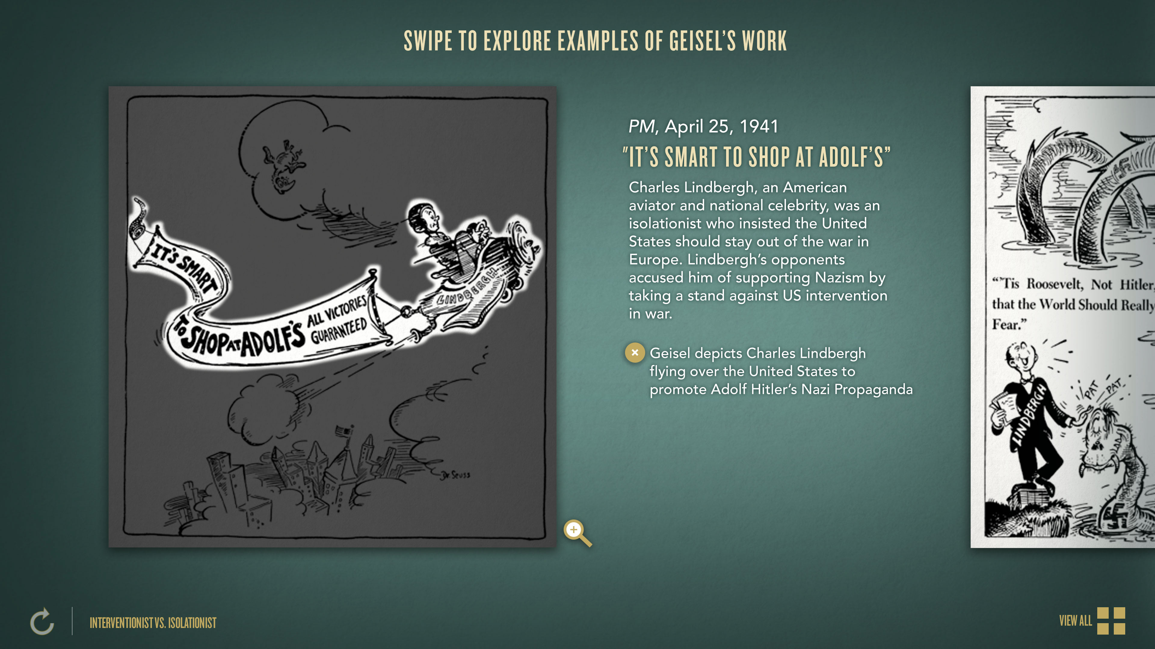
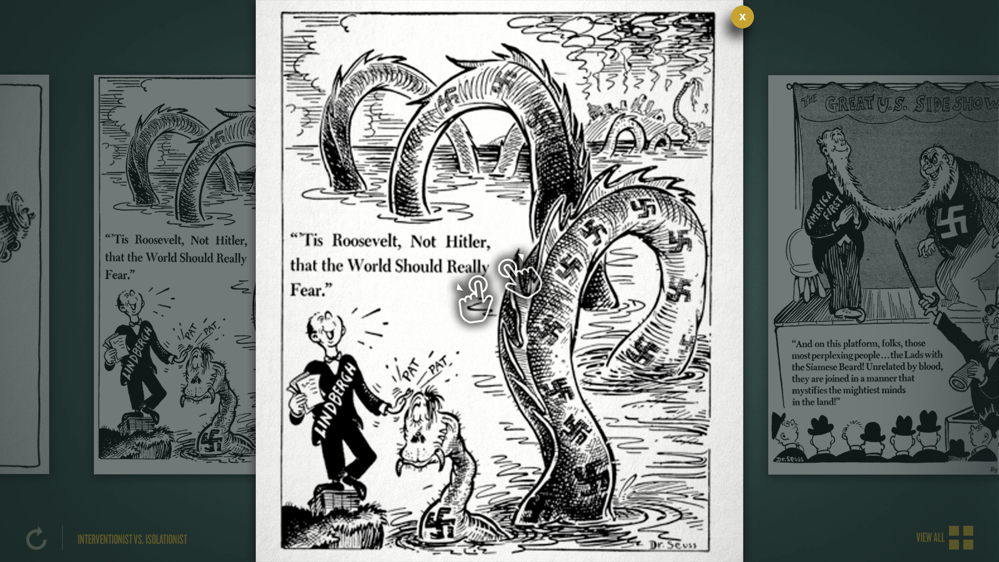
User testing showed that some users had difficulty knowing which bits of information were associated with specific parts of the cartoon. The text descriptions were either not clear enough or not being read by users.
Design Solution:
New design frames were created to propose a change in functionality so that brief descriptions were associated with buttons. Once one of the buttons was clicked, more detailed information appeared and the specific are of the cartoon being discussed was highlighted. These design changes and changes in functionality were done in conjunction with programmers to ensure the changes were feasible.
Full Interactive: